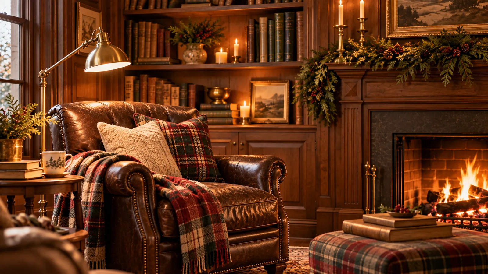
The "Ralph Lauren Christmas" look is everywhere on Pinterest right now, and it is not hard to see why. It reads collected, not bought, warm without trying too hard, and it holds up in a formal living room or a small apartment just the same. What is harder to see from a photo is which pieces actually build that look, and which ones just add more Christmas without adding the right kind.
This is not a full room redo. It is a short list of the pieces that matter most if you are only adding a few new things this year: the tree, the ribbon, the wreath, the ornaments, and the mantel. None of those five do much on their own if the room around them is not pulling its own weight too, so that is actually where this list starts.
This post contains affiliate links. As an Amazon Associate, I earn from qualifying purchases, at no extra cost to you. #ad
What Actually Makes It Read "Ralph Lauren"
Most Christmas decor defaults to bright red and green. The classic look pulls from a narrower, deeper palette instead: hunter green, burgundy or oxblood, navy, espresso brown, and brass or gold with a bit of age on it, with cream filling in the quiet spaces between. Nothing about it is muted or sparse, if anything it leans toward more layering, not less. It is just deliberate about which colors and finishes are allowed in the room at once, the same reason something with a little age or patina on it belongs here, and something bright and obviously new usually does not.
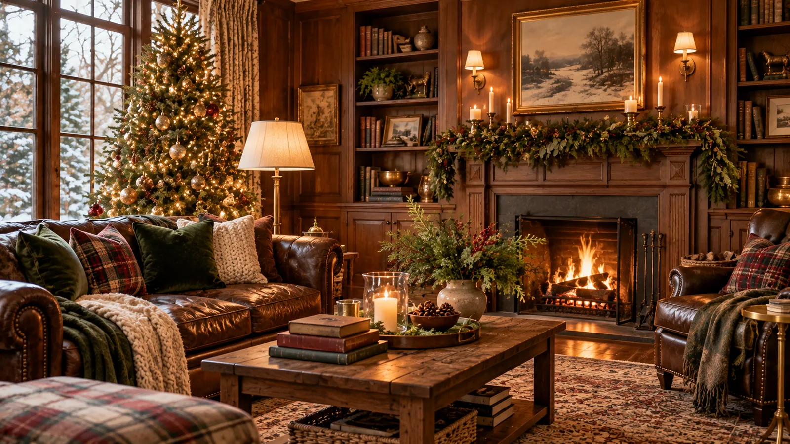
Texture does the rest of the work. Velvet, brass, glass, and real greenery next to each other is what makes a tree or a mantel feel layered instead of matched. A display built from one finish, all shiny ornaments or all matte, falls flat next to one that mixes them, even when the color palette is identical. A quiet equestrian touch, a framed print, a riding motif worked into a single object rather than a whole theme, tends to show up somewhere in the room too. It reads as one more collected material, the same way the velvet and brass do.
The formula repeats everywhere it works: a tight color palette, one pattern used sparingly, several materials mixed on purpose, and finishes with a little age on them. That combination is what looks expensive, not the colors themselves.
Look Around the Room First
The strongest versions of this look lean on a lot of texture and pattern working together inside that tight palette, dark wood, leather, plaid, silver or crystal, warm lamp light, not just whatever goes on the tree. That is worth knowing before buying anything else, because most homes already have a head start. Dark wood picture frames, an old leather-bound book on a side table, a plaid throw that already lives on the back of a chair, a silver candlestick from a cabinet that never gets used, all of it belongs in this look exactly as it already is, the same instinct that makes it worth getting a guest room ready before anyone arrives: notice what is already there before adding anything new.
Turn on a lamp instead of the overhead light before deciding anything else needs to change. Warm, low light does more to make a room feel collected than a single new object ever will, and it costs nothing. Once the room itself is doing some of the work, the five pieces on this list have a lot less to prove on their own, the same idea behind choosing fewer, better gifts for the homebody on your list: pick fewer new pieces, pick them well.
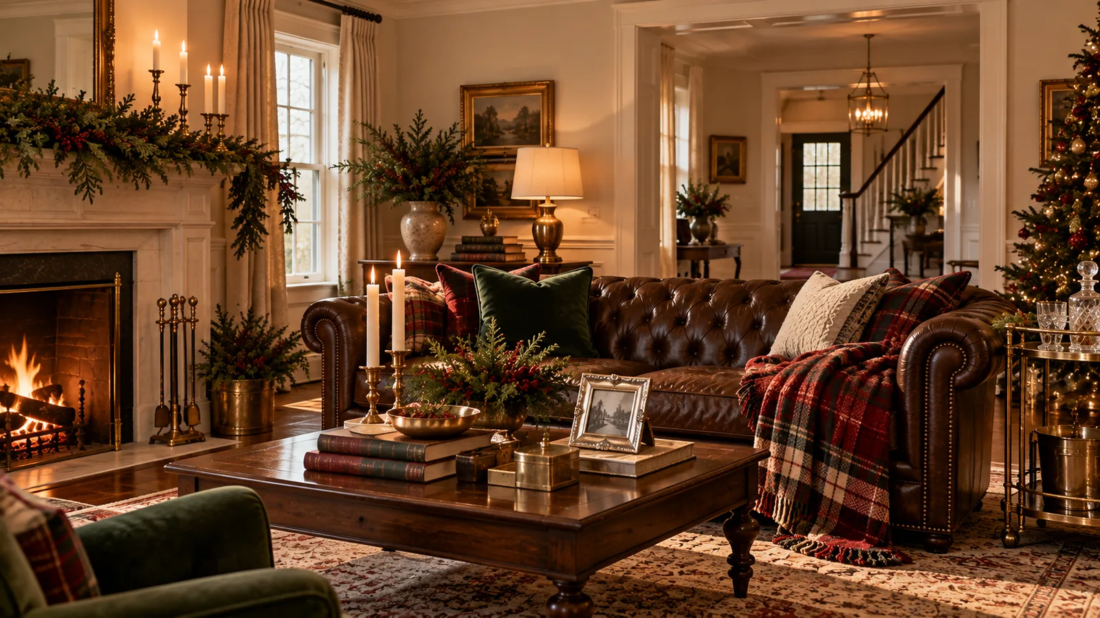
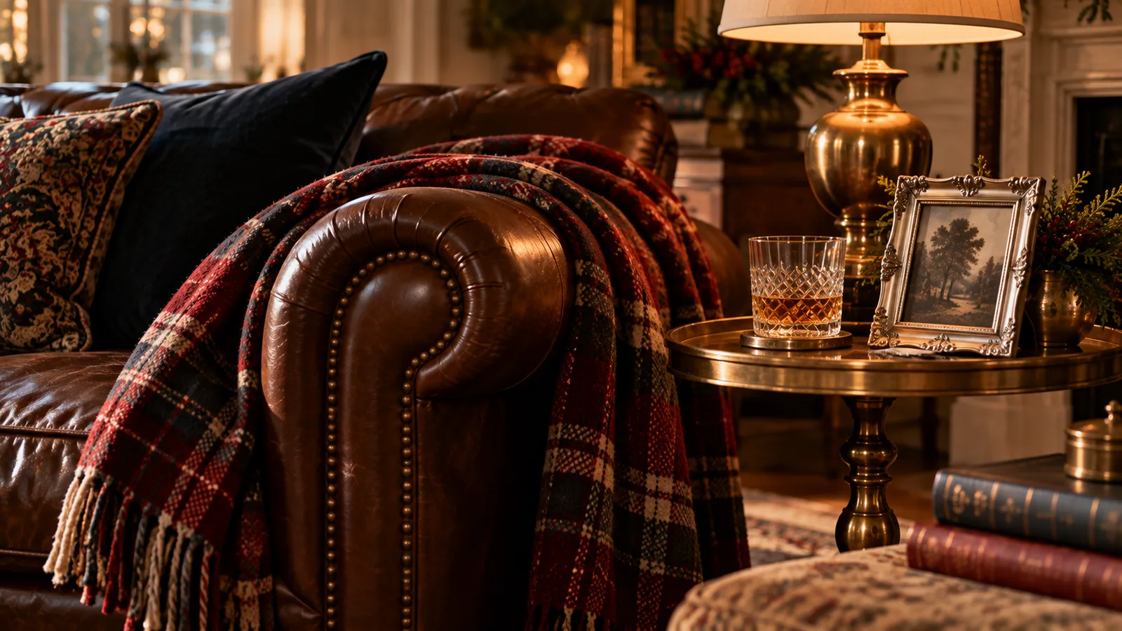
Notice what's already there before adding anything new.
The Tree: Where the Look Starts
The tree sets the palette for everything else in the room, so it is worth getting right before anything else goes up. A full, dense pre-lit balsam fir works especially well for this look, branch tips close enough together that ornaments have something to nest into, not just hang off. A capiz star treetop in place of a bow or an angel is one of the fastest single swaps that shifts a tree from generic to collected.
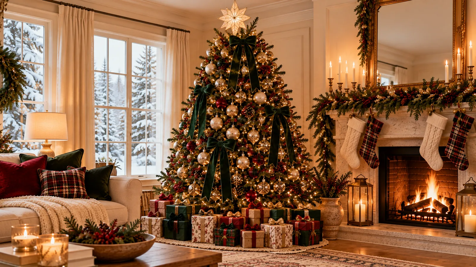


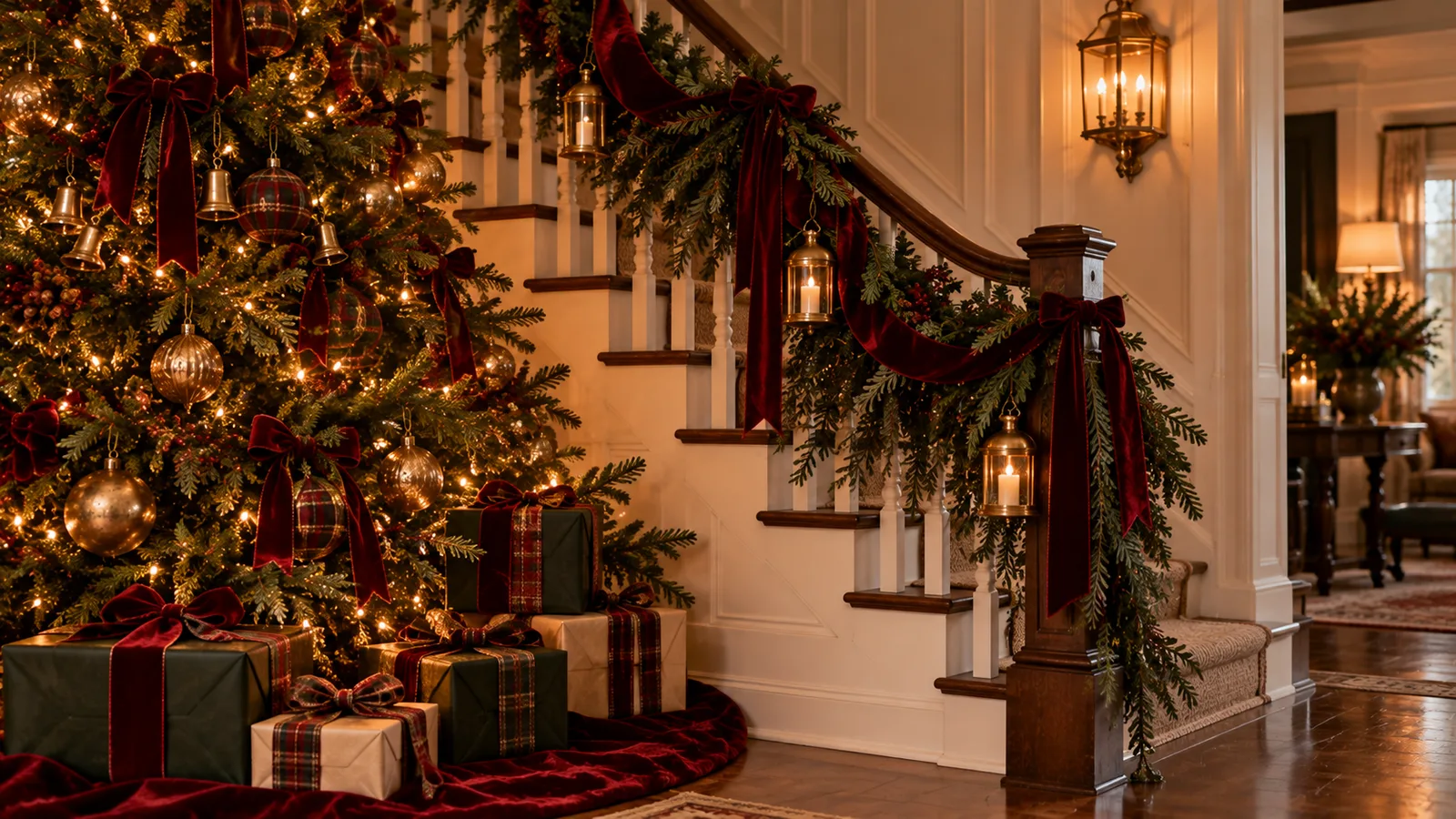
A tree that sets the palette for the whole room.
If a full tree is not in the budget or the space this year, a pair of small resin tabletop trees does real work on a console table or a mantel, especially finished in a distressed gold that already matches the brass in the rest of the room. Two small trees, styled with intention, read more collected than one large tree that was decorated in a hurry.
Ribbon: The Layering Trick, Not an All-Over Print
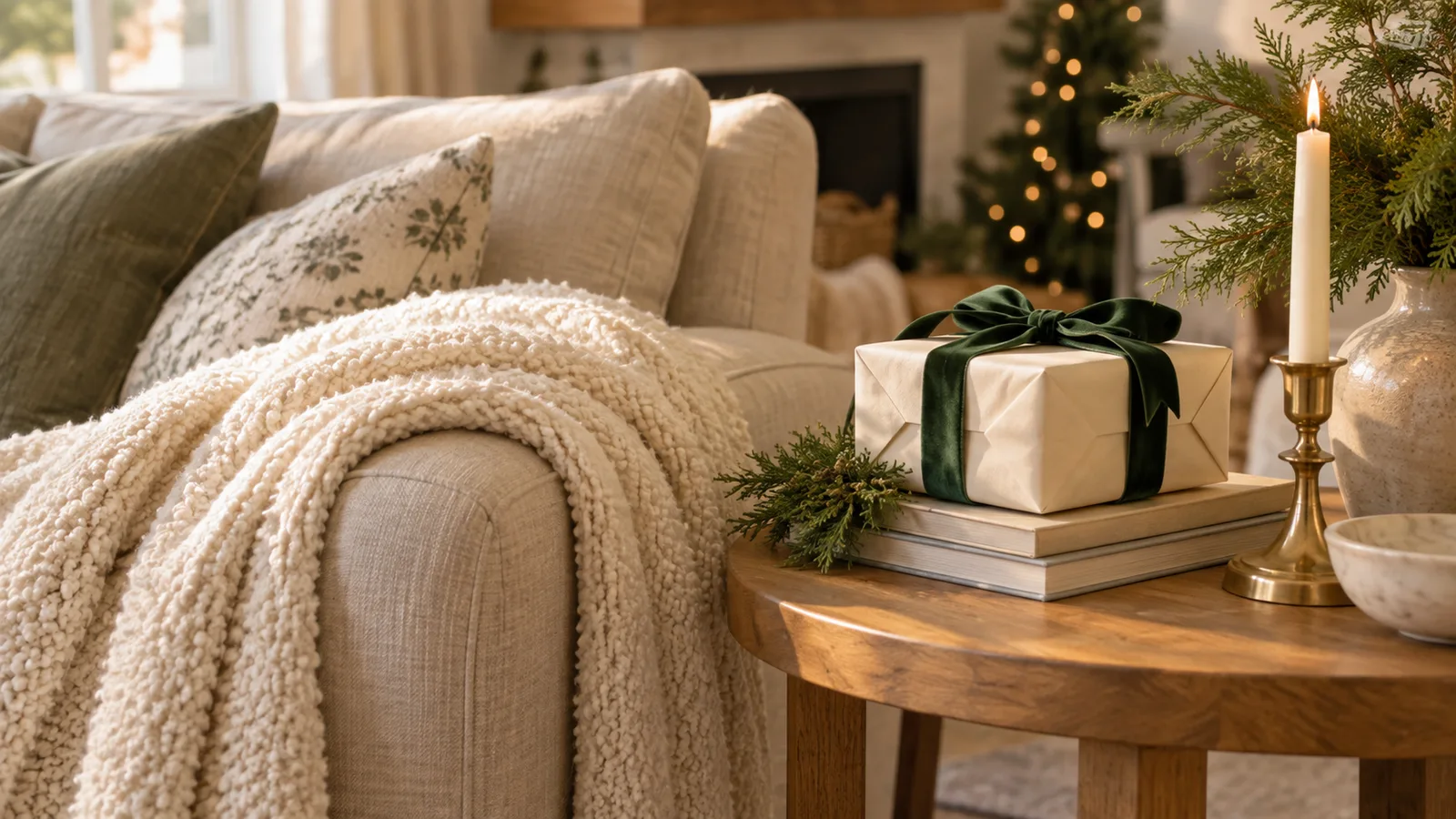
Ribbon is the piece that convinces people this look is more complicated than it is. The trick is that it is one continuous material, usually velvet, woven through the tree, tied onto the wreath, and used for gift wrap, rather than a print applied to every surface in the room. A dark green velvet ribbon is the most versatile starting point, since it works as a stand-in for the "greenery" color without competing with the actual greenery.
From there, a second color in the same velvet finish gives the layering some depth without tipping into busy. A red velvet ribbon works well against the hunter green if the room can take a little more warmth. If it already leans warm, skip the second color entirely and let the green carry the whole look on its own. Whichever you pick, use it everywhere: tree, wreath, and wrapping paper, so it looks like a decision instead of a leftover craft supply.


One ribbon, used everywhere, looks intentional.
This is also where the plaid question comes up most. Tartan is genuinely part of this look, and plenty of real versions of it use plaid generously, across table linens and more, not sparingly. For a calmer, more livable take, Casita's version keeps it to one or two moments instead, a bow, a stocking, a throw on the sofa, not layered onto the tree, the wreath, and the table runner all at once. That is a choice about what is easy to live with day to day, not a rule the look itself requires.
The Wreath: The First Thing Anyone Sees
A front door wreath does more to set the tone of a home than almost anything else on this list, since it is the first thing a guest sees before they are even inside. A full cedar wreath finished with one oversized burgundy velvet bow does exactly what the ribbon rule above describes: one confident color moment against real greenery, nothing competing with it.
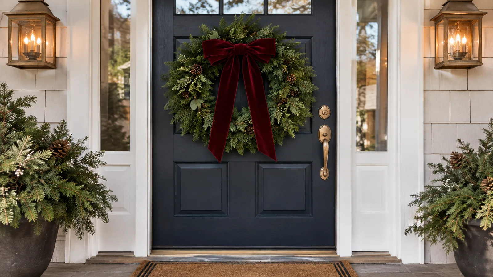
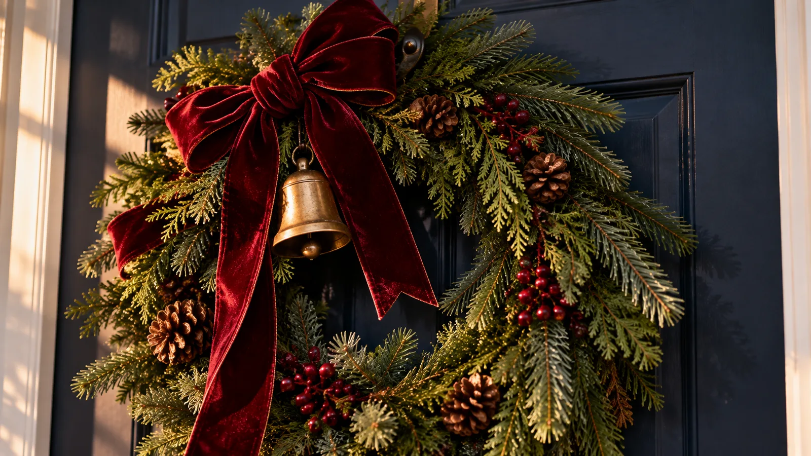
One color moment against real greenery, nothing competing with it.
The same cedar works past the front door, too. A length of cedar garland swag along a staircase or a mantel edge extends the same texture through the house instead of treating the wreath as an isolated piece, which is part of what makes the whole home feel considered rather than just the door.
Ornaments: Collected, Not Bought as a Set
This is the section where a little mixing goes the furthest. A box of matching ornaments in one finish looks complete and put together, and there is nothing wrong with it. The classic look just gets more character when the finishes are mixed on purpose: shimmering champagne-gold mercury glass finials for shine and structure, next to a marbled mercury glass garland draped loosely through the branches, the same embossed, hand-finished texture in a softer taupe that feels collected rather than bought as a set.
Fill in the rest with a set of red velvet ball ornaments for the matte texture the glass and brass pieces need to sit against. A set of bronze, taupe, and ivory ornaments mixed in near the front of the tree keeps the same earthy, tonal palette from the ribbon and mantel present in the ornaments too, not just the accents around them.
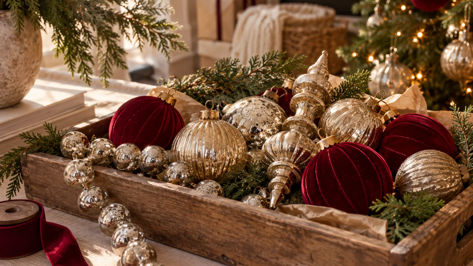

Mixed finishes, on purpose, not matched.
The Mantel: Where It Comes Together
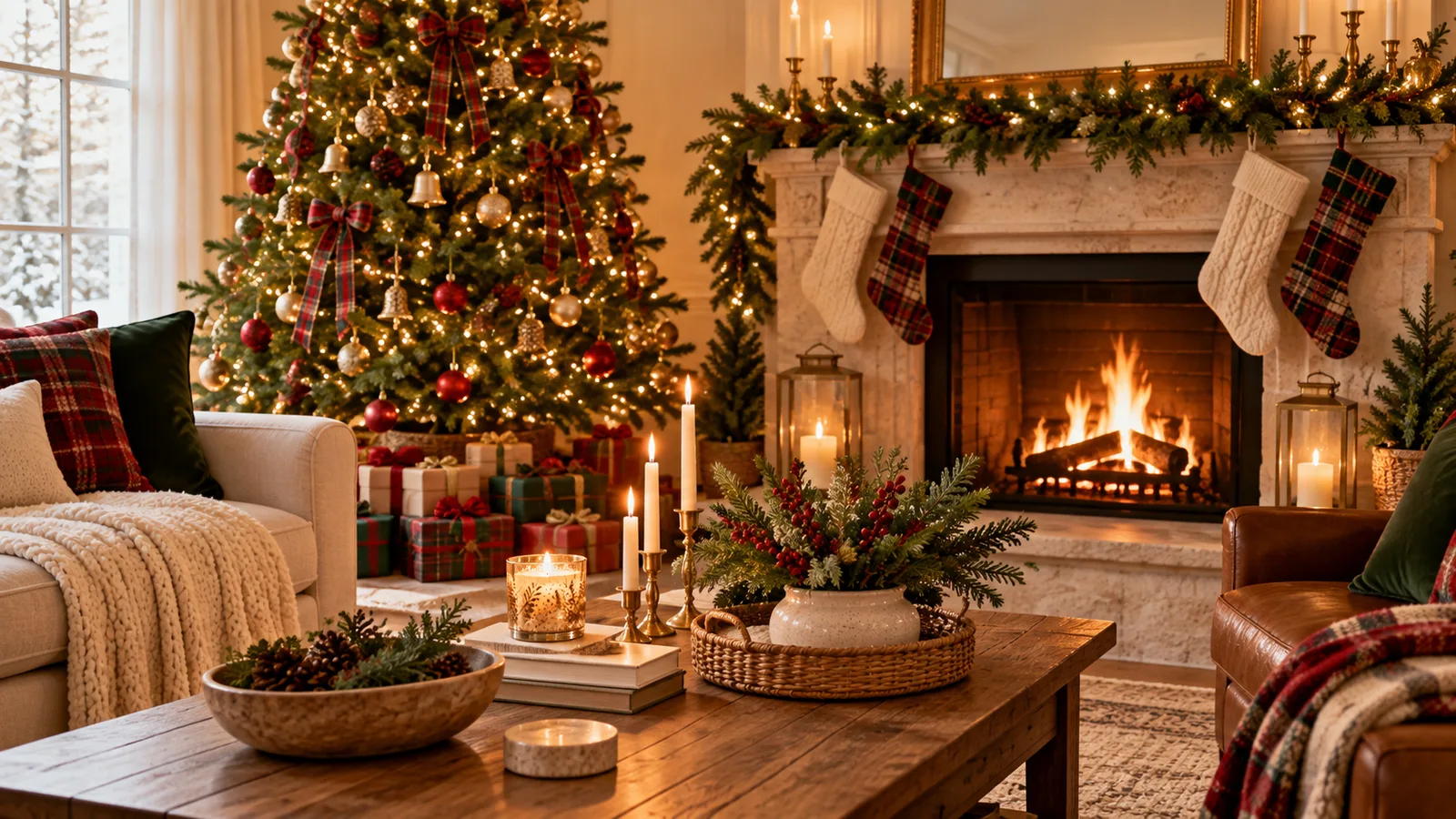
The mantel is the one spot in the house that gets to summarize everything else: the palette from the tree, the same ribbon color, and a bit more brass than anywhere else in the room. Start with greenery low and flat, then build height with a pair of flameless taper candles, which give the flicker of real candlelight without anything to watch near the greenery.
This is also the one spot where a real equestrian touch belongs, since it is one of the details most associated with the look. A small framed equestrian print propped on the mantel or hung just above it does the job quietly, one collected object, not a themed vignette. A burgundy velvet tree skirt at the base of the tree nearby carries the same oxblood note down to the floor, so the palette holds from the mantel all the way to the base of the tree. That is usually enough. The mantel does not need a fourth or fifth object to feel finished, just the same palette, in espresso brown and aged brass, showing up in a few different materials.
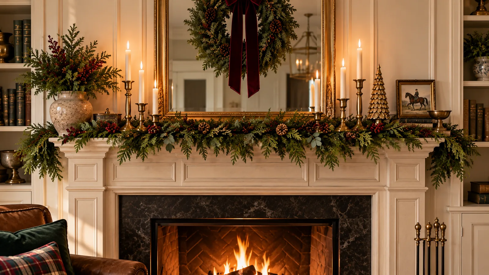
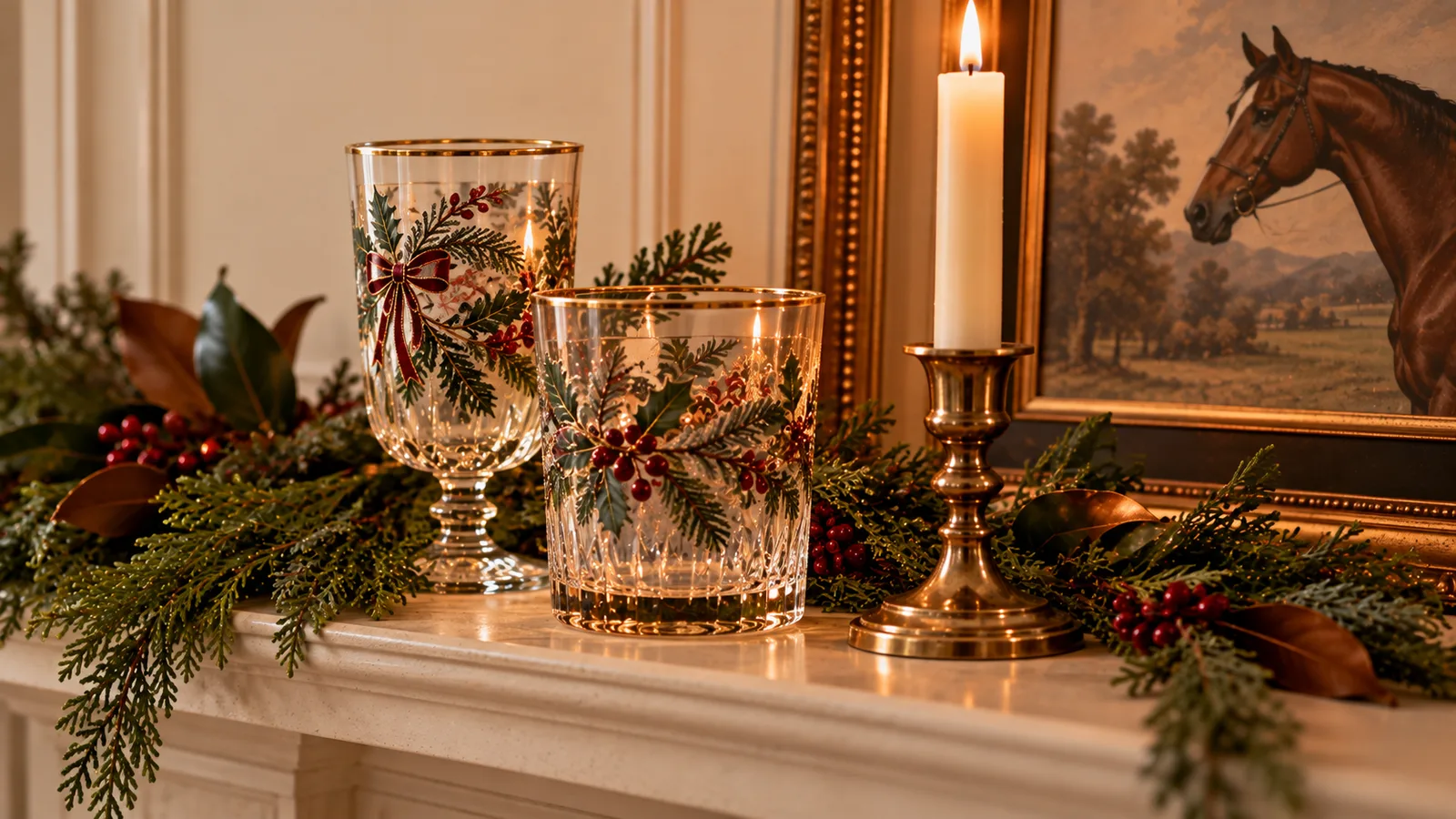
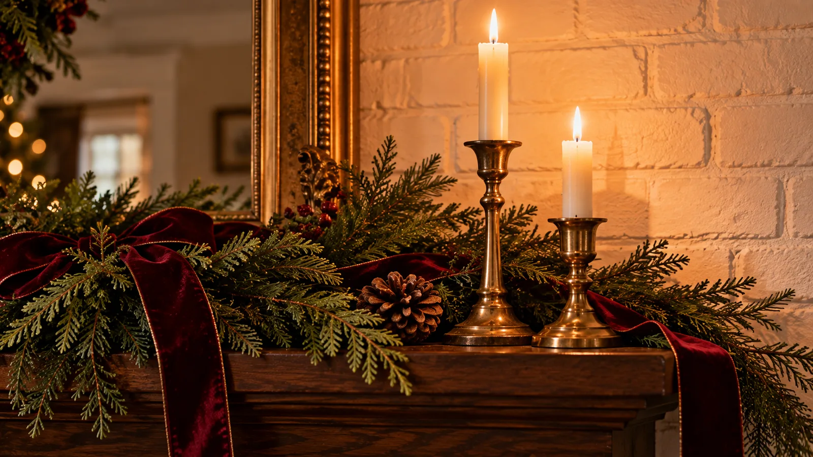
A framed equestrian print, the quiet detail that reads as Ralph Lauren.
If you only add three things from this list before the season gets busy, make it the ribbon, the wreath, and one round of ornaments mixed with what you already own. None of it requires replacing a tree that already works or redoing a room that already feels like home.